You know that Old Testament bookmark they give out in Seminary classes? That thing singlehandedly quadrupled my understanding of how the Bible stories fit together. Before seeing it, I never understood, when Moses led Israel out of Egypt, why they were slaves in Egypt to begin with. Then when I first perused that bookmark, I realized they went to Egypt during the events surrounding Joseph and his brothers. I know, I know—I could have figured that out by just reading Genesis. But I was like, twelve. Who does that at twelve?
Anyway, that timeline did a fantastic job of summarizing a lot of information into a form so concise yet intuitive that it doesn’t really even require a key; you can get the gist of it just by looking at it. The same goes for the Book of Mormon bookmark. I was disappointed when the New Testament and D&C bookmarks didn’t have the same kind of layout (they’re more like bullet lists of important events). I always wished there was a comparable bookmark summarizing the same kind of information in such a visually appealing way. Since no one had made one for Church history yet, I decided to create one last month for my ward’s Sunday school class in my hometown, Ukiah, California.
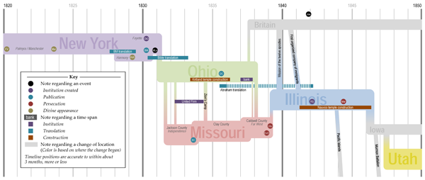
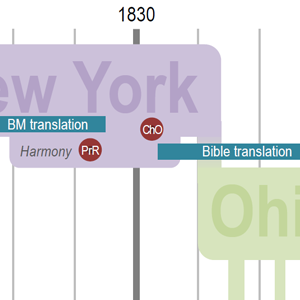
Like the Old Testament and Book of Mormon bookmarks, it’s part timeline (horizontal axis) and part map (vertical axis). Hence I’ve called it a “geographical timeline.” Also like the Old Testament bookmark, up-down roughly corresponds to east-west. I only went from 1820 to 1850 because that’s when most of the D&C sections were given, and that’s when many of the Church history stories you hear happened. The colors of the four major regions (purple New York, green Ohio, red Missouri, blue Illinois) correspond to the colors used in the appendixes and timelines of my StoryGuide Scriptures.
The notes at the bottom explain what dates I was using for a given event, and the backside contains more details and references. I specifically used basic Church publications whenever possible (which was the vast majority of the time) to show (1) you don’t have to have special training or access to create something like this, and (2) the Church has produced some dang good stuff, which we ought to take advantage of more often.
Of course, one of the hardest steps was figuring out which events to include, without cluttering the graphic so much that it stopped being a useful summary. I’m still tweaking it, adding or deleting events as I continue to mull things over. On the reverse side, with the expanded notes section, I’ve tried to leave on there all the events I’ve considered, even if they don’t make it onto the final timeline. I tried to make this timeline include most of the major benchmarks and landmark events in Church history so you can quickly place a story in context, seeing what was going on at the time. For example, you can see at a glance that when the first missionaries went to Britain, Zion’s Camp had already occurred, but not Liberty Jail, and the Kirtland bank crisis was underway.
I wish I had had a timeline like this earlier. It would have helped me more quickly get the big picture of early Church history. For example, I didn’t know there were two Church centers (Ohio and Missouri) during the 1830s until college. And whenever I heard a story about the Saints being driven from their homes, it was hard to place the story in context—there were, like, a half dozen times when they were driven out! Well, this geographical timeline is my attempt at making such stories easier to categorize in my mind. I hope it helps you, too.
Super! So very helpful. It would be interesting to take just one period such as Kirtland and Missouri and create a ThingLink of just that section (you can google that)
Holy mackerel, that’s a cool program. I’d never heard of it, but now my wife is prepping short videos to link to an interactive timeline we’re going to make. Thanks for the suggestion! If I may ask, how did you find the site?
So—maybe thank you is not enough. Love these.
You betcha! I’m glad it helps.
We are getting ready for a Church history tour. I was so grateful to find your time line. Thank you so much for sharing. Very helpful!
Excellent! Love maps like this.