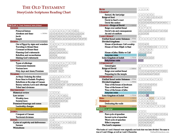
Several nifty reading charts are out there for keeping track of your progress as you read the standard works (for example, they hand one out with the seminary Scripture Mastery cards; other charts form a picture). This one, however, is different because it also depicts the larger structure of the Old Testament, to help you get the big picture. Most books (the larger ones) have major and minor subdivisions. For example, Daniel subdivides neatly into two parts: history (ch. 1–6) and prophecies (ch. 7–12). I’ve created multiple versions of the chart.
1. First is the basic version. This version is useful for any Christian who just wants to track their progress in reading the Bible.
StoryGuide Scriptures Reading Chart: Old Testament
(Basic)
The subdivisions I chose are based in part on the StoryGuide Scriptures—a customized version of the standard works that lays out the (unchanged) authorized text in paragraphs and with headings, so it looks more like a modern novel or textbook. If you’re interested in reading an edition of the scriptures that uses headings to depict this chart’s subdivisions in the actual text as you read, follow the link above. You can download it for free. [Note: The Old Testament is not completed yet.]
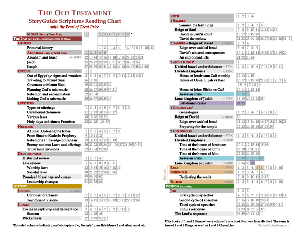
2. Second is a version which adds books from the Pearl of Great Price. That is, the books of Moses and Abraham are inserted near the beginning, in Genesis, where they fit most naturally; other than that, there is no difference between the two charts. The Pearl of Great Price chapters also have small dotted lines that help you align the parallel chapters (i.e., Genesis 1 parallels Moses 2 and Abraham 4, etc.).
StoryGuide Scriptures Reading Chart: Old Testament
(with the Pearl of Great Price)
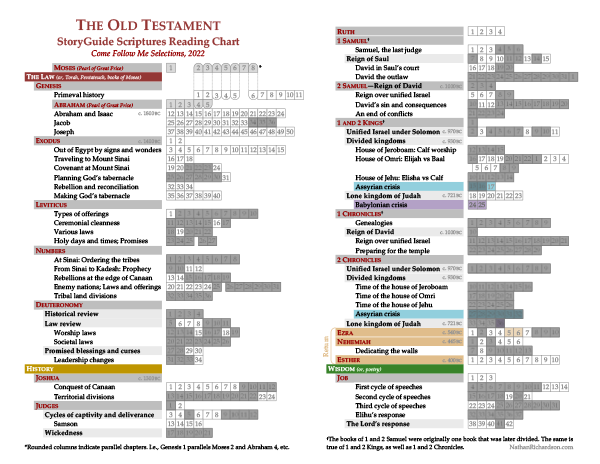
3. Third, I made a version for the Come Follow Me program of scripture study. This version is identical to the Pearl of Great Price version just above, except that chapters are blacked out which are not covered in the Come Follow Me reading schedule.
StoryGuide Scriptures Reading Chart: Old Testament
(Come Follow Me Selections, 2022)
Explanations
Perhaps one of the most helpful features of these charts is the color coding that enables readers to quickly understand what time period each of the prophet books is set in. The seventeen books of the prophets (Isaiah through Malachi) can be sorted into three basic time periods:
- The Assyrian crisis (2 Kgs. 15–17 / 2 Chron. 27–32), which culminated about 721 BC (aqua),
- The Babylonian crisis (2 Kgs. 24–25 / 2 Chron. 36), which culminated about 587 BC (purple), and
- The return from captivity, which began in about the late 500s BC (tan).
These time periods are indicated by shaded chapter boxes in the historical books, and by using the same colors to shade the book titles in the prophetic books. Thus you can quickly see that, e.g., Isaiah prophesied around the same time as Micah, and thus within the same basic historical context. Notice that the colors of the Assyrian and Babylonian crises (aqua and purple) match the colors used for the northern kingdom of Ephraim and the southern kingdom of Judah, on several other visual aids I’ve created—such as my Geographical Timeline of Scripture, or my Kings of Judah and Israel diagram. That’s because the Assyrians carried the northern kingdom of Ephraim into captivity, and the Babylonians carried the southern kingdom of Judah into captivity. It’s also convenient that they happened in A-B order, which makes it easier for learners to remember: first Assyria (A), then Babylon (B). By the way, I got the terms “Assyrian crisis” and “Babylonian crisis” from Christine Hayes’s free online Yale course on the Old Testament (there are of course many secular assumptions woven into the course, but on the whole it’s an excellent listen).
I have to admit that my subdivisions for the Old Testament are not as well-researched as the reading charts I’ve made for the other standard works. The Old Testament is a massive book, and I haven’t been able to read through it as many times as I have the other books of scripture, which I need to do in order to find the macro structures I hope to depict in these charts. Because of that, I resorted to searching online for outlines made by other people, then combining them or adapting them to the purposes of this chart. Over time, as I get chances to make a few more passes through the Old Testament, I will occasionally revise this chart.
For those who would like this chart adapted to show only the chapters required for seminary, see the Old Testament, Seminary selected readings chart.
And just to satisfy that bird’s-eye itch, here’s a Pinterest-friendly version of the whole chart in one continuous column:


